
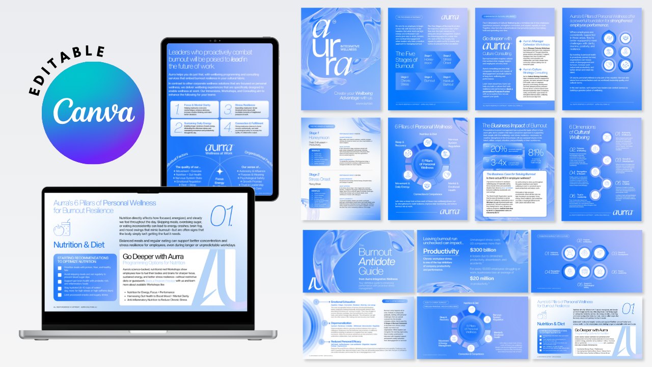
One resource, two ways to use it
This was a big one, a 47-page resource that works as both a learning tool and a conversion asset. I designed the whole thing in Figma first because it gives me way more precision, then moved it over to Canva in two formats, an editable PDF and an editable slide deck.
Doing it this way kept the brand consistent everywhere, and the client can now update the content themselves and use it as a presentation or a download. Every page was designed with clarity in mind, clear hierarchy, and CTAs and brand elements placed where they actually do their job.
My part in it
From the first layout in Figma to two fully editable files in Canva.
Outcomes and impact
The challenge
Fitting a lot of information into 47 pages without it feeling crowded, while keeping it on brand and easy to read. On top of that, the design had to survive the move from Figma to Canva in two formats and stay fully editable in both.
How I solved it
I set up a grid system for consistent layouts and built reusable components in Figma that translate cleanly into Canva. Used white space on purpose for readability, a clear heading system with color coded sections, and a step by step transfer process so nothing got lost going into the PDF and slide deck.
Tools I used
If I did it again
I'd add interactive bits to the PDF like clickable links and form fields, make animated slide templates for more dynamic presentations, and build a component library in both Figma and Canva so big projects like this go even faster.